Button
Buttons are used to initialize an action. Button labels express what action will occur when the user interacts with it.
Overview
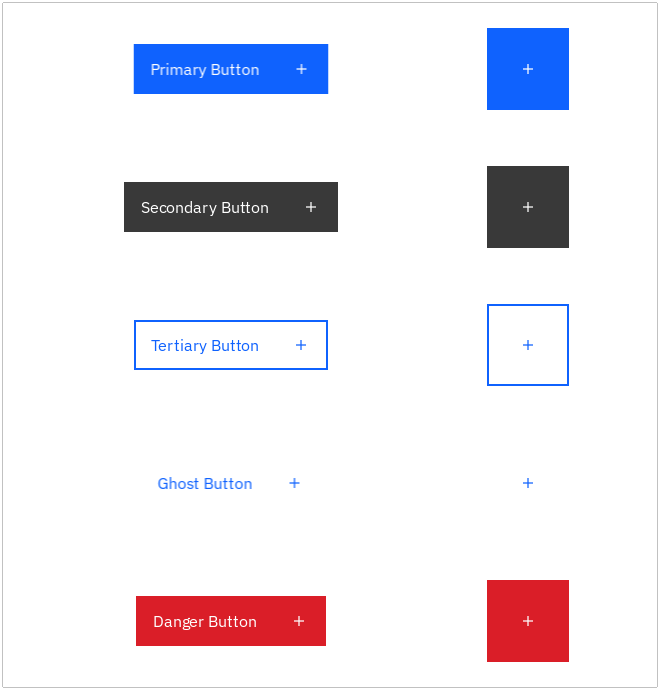
Buttons are clickable elements that are used to trigger actions. They communicate calls to action to the user and allow users to interact with pages in a variety of ways. Button labels express what action will occur when the user interacts with it.
By the latest CarbonKivy provides 3 types of button styles by default, however it holds the ability for developers to create thier own style customized buttons.
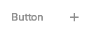
Live demo
Click the below buttons to test user interactivity.
Note
This live demo contains only a preview of functionality and styles available for this component. Actual widgets may not show the exact same behavior but similar to expected.
CButtonPrimary:
    text: "Button"
    role: "Large Productive"
    # icon: "add"
CButtonSecondary:
    text: "Button"
    role: "Large Productive"
    # icon: "add"
CButtonGhost:
    text: "Button"
    role: "Large Productive"
    # icon: "add"
CButtonTertiary:
    text: "Button"
    role: "Large Productive"
    # icon: "add"
CButtonDanger:
    text: "Button"
    variant: "Primary" # Primary (default), Tertiary, Ghost
    role: "Large Productive"
    # icon: "add"
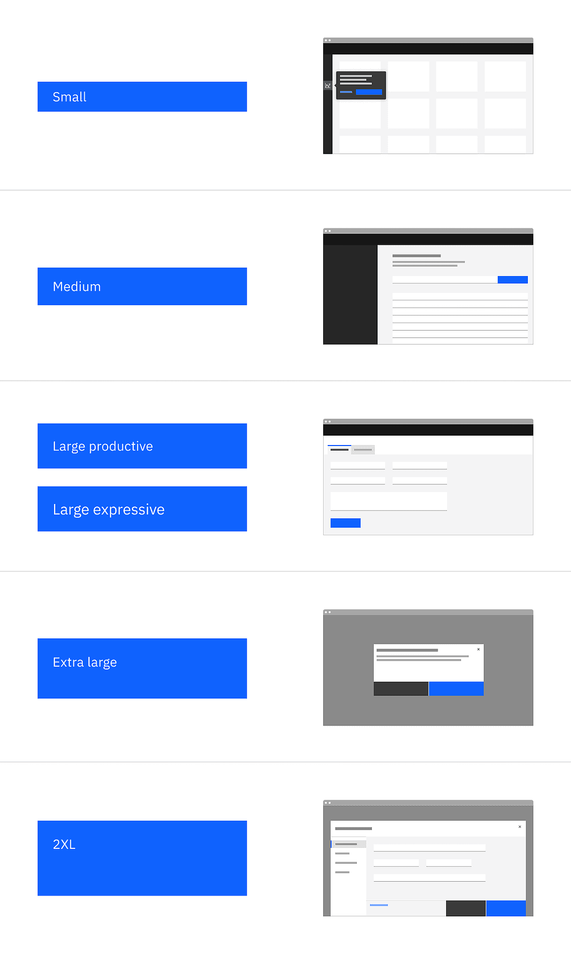
Size
There are six available size tokens for a button:
Small
Medium
Large Productive
Large Expressive
Extra Large
2XL
The Large Expressive button is used in editorial and digital marketing experiences.
Use the role property to define the token for the button size.
CButtonPrimary:
    text: "Button"
    role: "Extra Large" # Define the specific size token here (capitalized first letter of every word.)
Custom Button
To create a custom button using the CButton you have certain properties and methods which needs to be customized.
The CButton class inherits certain behaviors to enable smooth user interactivity during different interactive states. It also holds some pre-defined properties like padding, spacing, font_size, text_color, bg_color, inset_color, cstate, etc.
Let’s start with an example code:
CButton:
    text: "Button"
    text_color: "blue_60"
    icon: "add"
    cstate: "normal" # active, disabled, normal
    pos_hint: {"center_x" : 0.5, "center_y" : 0.5}
Appearance of Button in different interactive states is shown below:
|
|

|
|
To create an active state button you have to define the active_color, the color that appears when the button state is down.

CButton:
    text: "Button"
    icon: "add"
    active_color: app.button_primary_active
    cstate: "active" # active, disabled, normal
    pos_hint: {"center_x" : 0.5, "center_y" : 0.5}
Let’s create a button similar to CButtonPrimary by defining the color properties by ourselves.
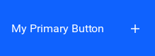
<MyPrimaryButton@CButton>:
    bg_color: app.button_primary
    hover_color: app.button_primary_hover
    active_color: app.button_primary_active

MyPrimaryButton:
    text: "My Primary Button"
    # cstate: "active" # active, disabled, normal (`default`)
    role: "2XL"
    icon: "add"
    pos_hint: {"center_x" : 0.5, "center_y" : 0.5}
Icon Button
To add icons to the button you have to define the icon, the icon that would appear at the specific slot aside the label or centralized in Icon Only Buttons.

CButtonPrimary:
    text: "Button"
    icon: "add"
    role: "Large Productive"
    icon: "add"

CButtonPrimary:
    icon: "add"
    role: "Large Productive"
    spacing: 0
Note
For an Icon Only Button you have to only define the icon property and set the button spacing to 0 for centralized icon slot.
Example
Run the below python script for a full-fledged running Example.
from kivy.core.window import Window
from kivy.clock import Clock


def set_softinput(*args) -> None:
    Window.keyboard_anim_args = {"d": 0.2, "t": "in_out_expo"}
    Window.softinput_mode = "below_target"


Window.on_restore(Clock.schedule_once(set_softinput, 0.1))

appkv = """
CScreen:

    CButtonPrimary:
        text: "Primary Button"
        role: "Large Productive"
        icon: "add"
        pos_hint: {'center_y': 0.9, 'center_x': 0.35}

    CButtonPrimary:
        icon: "add"
        role: "2XL"
        spacing: 0
        pos_hint: {'center_y': 0.9, 'center_x': 0.8}

    CButtonSecondary:
        text: "Secondary Button"
        role: "Large Productive"
        icon: "add"
        pos_hint: {'center_y': 0.7, 'center_x': 0.35}

    CButtonSecondary:
        icon: "add"
        role: "2XL"
        spacing: 0
        pos_hint: {'center_y': 0.7, 'center_x': 0.8}

    CButtonTertiary:
        text: "Tertiary Button"
        role: "Large Productive"
        icon: "add"
        pos_hint: {'center_y': 0.5, 'center_x': 0.35}

    CButtonTertiary:
        icon: "add"
        role: "2XL"
        spacing: 0
        pos_hint: {'center_y': 0.5, 'center_x': 0.8}

    CButtonGhost:
        text: "Ghost Button"
        role: "Large Productive"
        icon: "add"
        pos_hint: {'center_y': 0.3,  'center_x': 0.35}

    CButtonGhost:
        icon: "add"
        role: "2XL"
        spacing: 0
        pos_hint: {'center_y': 0.3, 'center_x': 0.8}

    CButtonDanger:
        text: "Danger Button"
        role: "Large Productive"
        icon: "add"
        pos_hint: {'center_y': 0.1,  'center_x': 0.35}

    CButtonDanger:
        icon: "add"
        role: "2XL"
        spacing: 0
        pos_hint: {'center_y': 0.1, 'center_x': 0.8}
"""

from kivy.lang import Builder
from carbonkivy.app import CarbonApp


class myapp(CarbonApp):
    def __init__(self, *args, **kwargs):
        super(myapp, self).__init__(*args, **kwargs)

    def build(self, *args) -> None:
        screen = Builder.load_string(appkv)
        return screen


if __name__ == "__main__":
    myapp().run()
API
- class carbonkivy.uix.button.button.CButton(*args: Any, **kwargs: Any)[source]
Bases:
AdaptiveBehavior,BackgroundColorBehaviorRectangular,StateFocusBehavior,ButtonBehavior,DeclarativeBehavior,HoverBehavior,RelativeLayout- actual_width
NumericProperty(defaultvalue=0, **kw) Property that represents a numeric value.
It only accepts the int or float numeric data type or a string that can be converted to a number as shown below. For other numeric types use ObjectProperty or use errorhandler to convert it to an int/float.
It does not support numpy numbers so they must be manually converted to int/float. E.g.
widget.num = np.arange(4)[0]will raise an exception. Numpy arrays are not supported at all, even by ObjectProperty because their comparison does not return a bool. But if you must use a Kivy property, use a ObjectProperty withcomparatorset tonp.array_equal. E.g.:>>> class A(EventDispatcher): ... data = ObjectProperty(comparator=np.array_equal) >>> a = A() >>> a.bind(data=print) >>> a.data = np.arange(2) <__main__.A object at 0x000001C839B50208> [0 1] >>> a.data = np.arange(3) <__main__.A object at 0x000001C839B50208> [0 1 2]- Parameters:
- defaultvalue: int or float, defaults to 0
Specifies the default value of the property.
>>> wid = Widget()
>>> wid.x = 42
>>> print(wid.x)
42
>>> wid.x = "plop"
 Traceback (most recent call last):
   File "<stdin>", line 1, in <module>
   File "properties.pyx", line 93, in kivy.properties.Property.__set__
   File "properties.pyx", line 111, in kivy.properties.Property.set
   File "properties.pyx", line 159, in kivy.properties.NumericProperty.check
 ValueError: NumericProperty accept only int/float
Changed in version 1.4.1: NumericProperty can now accept custom text and tuple value to indicate a type, like “in”, “pt”, “px”, “cm”, “mm”, in the format: ‘10pt’ or (10, ‘pt’).
- cbutton_layout
ObjectProperty(defaultvalue=None, rebind=False, **kw) Property that represents a Python object.
- Parameters:
- defaultvalue: object type
Specifies the default value of the property.
- rebind: bool, defaults to False
Whether kv rules using this object as an intermediate attribute in a kv rule, will update the bound property when this object changes.
That is the standard behavior is that if there’s a kv rule
text: self.a.b.c.d, wherea,b, andcare properties withrebindFalseanddis aStringProperty. Then when the rule is applied,textbecomes bound only tod. Ifa,b, orcchange,textstill remains bound tod. Furthermore, if any of them wereNonewhen the rule was initially evaluated, e.g.bwasNone; thentextis bound toband will not become bound todeven whenbis changed to not beNone.By setting
rebindtoTrue, however, the rule will be re-evaluated and all the properties rebound when that intermediate property changes. E.g. in the example above, wheneverbchanges or becomes notNoneif it wasNonebefore,textis evaluated again and becomes rebound tod. The overall result is thattextis now bound to all the properties amonga,b, orcthat haverebindset toTrue.- **kwargs: a list of keyword arguments
- baseclass
If kwargs includes a baseclass argument, this value will be used for validation: isinstance(value, kwargs[‘baseclass’]).
Warning
To mark the property as changed, you must reassign a new python object.
Changed in version 1.9.0: rebind has been introduced.
Changed in version 1.7.0: baseclass parameter added.
- font_size
NumericProperty(defaultvalue=0, **kw) Property that represents a numeric value.
It only accepts the int or float numeric data type or a string that can be converted to a number as shown below. For other numeric types use ObjectProperty or use errorhandler to convert it to an int/float.
It does not support numpy numbers so they must be manually converted to int/float. E.g.
widget.num = np.arange(4)[0]will raise an exception. Numpy arrays are not supported at all, even by ObjectProperty because their comparison does not return a bool. But if you must use a Kivy property, use a ObjectProperty withcomparatorset tonp.array_equal. E.g.:>>> class A(EventDispatcher): ... data = ObjectProperty(comparator=np.array_equal) >>> a = A() >>> a.bind(data=print) >>> a.data = np.arange(2) <__main__.A object at 0x000001C839B50208> [0 1] >>> a.data = np.arange(3) <__main__.A object at 0x000001C839B50208> [0 1 2]- Parameters:
- defaultvalue: int or float, defaults to 0
Specifies the default value of the property.
>>> wid = Widget()
>>> wid.x = 42
>>> print(wid.x)
42
>>> wid.x = "plop"
 Traceback (most recent call last):
   File "<stdin>", line 1, in <module>
   File "properties.pyx", line 93, in kivy.properties.Property.__set__
   File "properties.pyx", line 111, in kivy.properties.Property.set
   File "properties.pyx", line 159, in kivy.properties.NumericProperty.check
 ValueError: NumericProperty accept only int/float
Changed in version 1.4.1: NumericProperty can now accept custom text and tuple value to indicate a type, like “in”, “pt”, “px”, “cm”, “mm”, in the format: ‘10pt’ or (10, ‘pt’).
- icon
StringProperty(defaultvalue=u’’, **kw) Property that represents a string value.
- Parameters:
- defaultvalue: string, defaults to ‘’
Specifies the default value of the property.
- icon_color
ColorProperty(defaultvalue=0, **kw) Property that represents a color. The assignment can take either:
a collection of 3 or 4 float values between 0-1 (kivy default)
a string in the format #rrggbb or #rrggbbaa
a string representing color name (eg. ‘red’, ‘yellow’, ‘green’)
Object
colormapis used to retrieve color from color name and names definitions can be found at this link. Color can be assigned in different formats, but it will be returned asObservableListof 4 float elements with values between 0-1.- Parameters:
- defaultvalue: list or string, defaults to [1.0, 1.0, 1.0, 1.0]
Specifies the default value of the property.
Added in version 1.10.0.
Changed in version 2.0.0: Color value will be dispatched when set through indexing or slicing, but when setting with slice you must ensure that slice has 4 components with float values between 0-1. Assingning color name as value is now supported. Value None is allowed as default value for property.
- padding
VariableListProperty(defaultvalue=None, length=4, **kw) A ListProperty that allows you to work with a variable amount of
list items and to expand them to the desired list size.
For example, GridLayout’s padding used to just accept one numeric value which was applied equally to the left, top, right and bottom of the GridLayout. Now padding can be given one, two or four values, which are expanded into a length four list [left, top, right, bottom] and stored in the property.
- Parameters:
- default: a default list of values
Specifies the default values for the list.
- length: int, one of 2 or 4.
Specifies the length of the final list. The default list will be expanded to match a list of this length.
- **kwargs: a list of keyword arguments
Not currently used.
Keeping in mind that the default list is expanded to a list of length 4, here are some examples of how VariableListProperty is handled.
VariableListProperty([1]) represents [1, 1, 1, 1].
VariableListProperty([1, 2]) represents [1, 2, 1, 2].
VariableListProperty([‘1px’, (2, ‘px’), 3, 4.0]) represents [1, 2, 3, 4.0].
VariableListProperty(5) represents [5, 5, 5, 5].
VariableListProperty(3, length=2) represents [3, 3].
Added in version 1.7.0.
- role
OptionProperty(*largs, **kw) Property that represents a string from a predefined list of valid
options.
If the string set in the property is not in the list of valid options (passed at property creation time), a ValueError exception will be raised.
- Parameters:
- default: any valid type in the list of options
Specifies the default value of the property.
- **kwargs: a list of keyword arguments
Should include an options parameter specifying a list (not tuple) of valid options.
For example:
class MyWidget(Widget):
    state = OptionProperty("None", options=["On", "Off", "None"])
- text
StringProperty(defaultvalue=u’’, **kw) Property that represents a string value.
- Parameters:
- defaultvalue: string, defaults to ‘’
Specifies the default value of the property.
- text_color
ColorProperty(defaultvalue=0, **kw) Property that represents a color. The assignment can take either:
a collection of 3 or 4 float values between 0-1 (kivy default)
a string in the format #rrggbb or #rrggbbaa
a string representing color name (eg. ‘red’, ‘yellow’, ‘green’)
Object
colormapis used to retrieve color from color name and names definitions can be found at this link. Color can be assigned in different formats, but it will be returned asObservableListof 4 float elements with values between 0-1.- Parameters:
- defaultvalue: list or string, defaults to [1.0, 1.0, 1.0, 1.0]
Specifies the default value of the property.
Added in version 1.10.0.
Changed in version 2.0.0: Color value will be dispatched when set through indexing or slicing, but when setting with slice you must ensure that slice has 4 components with float values between 0-1. Assingning color name as value is now supported. Value None is allowed as default value for property.
- text_color_disabled
ColorProperty(defaultvalue=0, **kw) Property that represents a color. The assignment can take either:
a collection of 3 or 4 float values between 0-1 (kivy default)
a string in the format #rrggbb or #rrggbbaa
a string representing color name (eg. ‘red’, ‘yellow’, ‘green’)
Object
colormapis used to retrieve color from color name and names definitions can be found at this link. Color can be assigned in different formats, but it will be returned asObservableListof 4 float elements with values between 0-1.- Parameters:
- defaultvalue: list or string, defaults to [1.0, 1.0, 1.0, 1.0]
Specifies the default value of the property.
Added in version 1.10.0.
Changed in version 2.0.0: Color value will be dispatched when set through indexing or slicing, but when setting with slice you must ensure that slice has 4 components with float values between 0-1. Assingning color name as value is now supported. Value None is allowed as default value for property.
- text_color_focus
ColorProperty(defaultvalue=0, **kw) Property that represents a color. The assignment can take either:
a collection of 3 or 4 float values between 0-1 (kivy default)
a string in the format #rrggbb or #rrggbbaa
a string representing color name (eg. ‘red’, ‘yellow’, ‘green’)
Object
colormapis used to retrieve color from color name and names definitions can be found at this link. Color can be assigned in different formats, but it will be returned asObservableListof 4 float elements with values between 0-1.- Parameters:
- defaultvalue: list or string, defaults to [1.0, 1.0, 1.0, 1.0]
Specifies the default value of the property.
Added in version 1.10.0.
Changed in version 2.0.0: Color value will be dispatched when set through indexing or slicing, but when setting with slice you must ensure that slice has 4 components with float values between 0-1. Assingning color name as value is now supported. Value None is allowed as default value for property.
- text_color_hover
ColorProperty(defaultvalue=0, **kw) Property that represents a color. The assignment can take either:
a collection of 3 or 4 float values between 0-1 (kivy default)
a string in the format #rrggbb or #rrggbbaa
a string representing color name (eg. ‘red’, ‘yellow’, ‘green’)
Object
colormapis used to retrieve color from color name and names definitions can be found at this link. Color can be assigned in different formats, but it will be returned asObservableListof 4 float elements with values between 0-1.- Parameters:
- defaultvalue: list or string, defaults to [1.0, 1.0, 1.0, 1.0]
Specifies the default value of the property.
Added in version 1.10.0.
Changed in version 2.0.0: Color value will be dispatched when set through indexing or slicing, but when setting with slice you must ensure that slice has 4 components with float values between 0-1. Assingning color name as value is now supported. Value None is allowed as default value for property.
- class carbonkivy.uix.button.button.CButtonDanger(*args: Any, **kwargs: Any)[source]
Bases:
CButton- cstate
OptionProperty(*largs, **kw) Property that represents a string from a predefined list of valid
options.
If the string set in the property is not in the list of valid options (passed at property creation time), a ValueError exception will be raised.
- Parameters:
- default: any valid type in the list of options
Specifies the default value of the property.
- **kwargs: a list of keyword arguments
Should include an options parameter specifying a list (not tuple) of valid options.
For example:
class MyWidget(Widget):
    state = OptionProperty("None", options=["On", "Off", "None"])
- variant
OptionProperty(*largs, **kw) Property that represents a string from a predefined list of valid
options.
If the string set in the property is not in the list of valid options (passed at property creation time), a ValueError exception will be raised.
- Parameters:
- default: any valid type in the list of options
Specifies the default value of the property.
- **kwargs: a list of keyword arguments
Should include an options parameter specifying a list (not tuple) of valid options.
For example:
class MyWidget(Widget):
    state = OptionProperty("None", options=["On", "Off", "None"])