Link
Links are used as navigational elements. They navigate users to another location, such as a different site, resource, or section within the same page.
Overview
Links are used as navigational elements and can be used on their own or inline with text. They provide a lightweight option for navigation, but like other interactive elements, too many links will clutter a page and make it difficult for users to identify their next steps.
Live demo
Click below links to test user interactivity.
Note
This live demo contains only a preview of functionality and styles available for this component. Actual widgets may not show the exact same behavior but similar to expected.
CLink:
    url: "https://github.com/CarbonKivy"
    external: True # if true will open a webbrowser tab redirecting to the url provided.

    CLinkText:
        text: "Link"
CLink:
    url: "https://carbondesignsystem.com"
    external: True # if true will open a webbrowser tab redirecting to the url provided.

    CLinkText:
        text: "Carbon Docs"

    CLinkIcon:
        icon: "arrow--up-right"
        font_size: plex_16
Size
There are three available size tokens for a link:
Small
Medium
Large
Use the role property to define the token for the link size.
CLink:
    url: "https://github.com/CarbonKivy"
    external: True # if true will open a webbrowser tab redirecting to the url provided.
    role: "Large" # Define the specific size token here (capitalized first letter of every word.)

    CLinkText:
        text: "CarbonKivy - Github"
Paired with Icon
CLink:
    url: "https://github.com/CarbonKivy"
    external: True # if true will open a webbrowser tab redirecting to the url provided.
    role: "Medium" # Define the specific size token here (capitalized first letter of every word.)

    CLinkText:
        text: "CarbonKivy - Github"

    CLinkIcon:
        icon: "logo--github"
Icon Only Link
Additionally, CarbonKivy provides you with the ability to create an Icon Only Link.
CLink:
    url: "https://github.com/CarbonKivy"
    external: True # if true will open a webbrowser tab redirecting to the url provided.
    role: "Medium" # Define the specific size token here (capitalized first letter of every word.)

    CLinkIcon:
        icon: "logo--github"
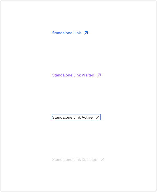
Styles
There are four default styles available for a link:
active
disabled
normal
visited
Use the cstate property to define the token for the link style.
CLink:
    url: "https://github.com/CarbonKivy"
    external: True # if true will open a webbrowser tab redirecting to the url provided.
    role: "Medium" # Define the specific size token here (capitalized first letter of every word.)
    cstate: "visited"

    CLinkIcon:
        icon: "logo--github"
API
- class carbonkivy.uix.link.link.CLink(*args: Any, **kwargs: Any)[source]
Bases:
AdaptiveBehavior,BackgroundColorBehaviorRectangular,StateFocusBehavior,ButtonBehavior,HoverBehavior,BoxLayout- cstate
OptionProperty(*largs, **kw) Property that represents a string from a predefined list of valid
options.
If the string set in the property is not in the list of valid options (passed at property creation time), a ValueError exception will be raised.
- Parameters:
- default: any valid type in the list of options
Specifies the default value of the property.
- **kwargs: a list of keyword arguments
Should include an options parameter specifying a list (not tuple) of valid options.
For example:
class MyWidget(Widget):
    state = OptionProperty("None", options=["On", "Off", "None"])
- external
BooleanProperty(defaultvalue=True, **kw) Property that represents only a boolean value.
- Parameters:
- defaultvalue: boolean
Specifies the default value of the property.
- font_size
NumericProperty(defaultvalue=0, **kw) Property that represents a numeric value.
It only accepts the int or float numeric data type or a string that can be converted to a number as shown below. For other numeric types use ObjectProperty or use errorhandler to convert it to an int/float.
It does not support numpy numbers so they must be manually converted to int/float. E.g.
widget.num = np.arange(4)[0]will raise an exception. Numpy arrays are not supported at all, even by ObjectProperty because their comparison does not return a bool. But if you must use a Kivy property, use a ObjectProperty withcomparatorset tonp.array_equal. E.g.:>>> class A(EventDispatcher): ... data = ObjectProperty(comparator=np.array_equal) >>> a = A() >>> a.bind(data=print) >>> a.data = np.arange(2) <__main__.A object at 0x000001C839B50208> [0 1] >>> a.data = np.arange(3) <__main__.A object at 0x000001C839B50208> [0 1 2]- Parameters:
- defaultvalue: int or float, defaults to 0
Specifies the default value of the property.
>>> wid = Widget()
>>> wid.x = 42
>>> print(wid.x)
42
>>> wid.x = "plop"
 Traceback (most recent call last):
   File "<stdin>", line 1, in <module>
   File "properties.pyx", line 93, in kivy.properties.Property.__set__
   File "properties.pyx", line 111, in kivy.properties.Property.set
   File "properties.pyx", line 159, in kivy.properties.NumericProperty.check
 ValueError: NumericProperty accept only int/float
Changed in version 1.4.1: NumericProperty can now accept custom text and tuple value to indicate a type, like “in”, “pt”, “px”, “cm”, “mm”, in the format: ‘10pt’ or (10, ‘pt’).
- role
OptionProperty(*largs, **kw) Property that represents a string from a predefined list of valid
options.
If the string set in the property is not in the list of valid options (passed at property creation time), a ValueError exception will be raised.
- Parameters:
- default: any valid type in the list of options
Specifies the default value of the property.
- **kwargs: a list of keyword arguments
Should include an options parameter specifying a list (not tuple) of valid options.
For example:
class MyWidget(Widget):
    state = OptionProperty("None", options=["On", "Off", "None"])
- text
StringProperty(defaultvalue=u’’, **kw) Property that represents a string value.
- Parameters:
- defaultvalue: string, defaults to ‘’
Specifies the default value of the property.
- text_color
ColorProperty(defaultvalue=0, **kw) Property that represents a color. The assignment can take either:
a collection of 3 or 4 float values between 0-1 (kivy default)
a string in the format #rrggbb or #rrggbbaa
a string representing color name (eg. ‘red’, ‘yellow’, ‘green’)
Object
colormapis used to retrieve color from color name and names definitions can be found at this link. Color can be assigned in different formats, but it will be returned asObservableListof 4 float elements with values between 0-1.- Parameters:
- defaultvalue: list or string, defaults to [1.0, 1.0, 1.0, 1.0]
Specifies the default value of the property.
Added in version 1.10.0.
Changed in version 2.0.0: Color value will be dispatched when set through indexing or slicing, but when setting with slice you must ensure that slice has 4 components with float values between 0-1. Assingning color name as value is now supported. Value None is allowed as default value for property.
- text_color_disabled
ColorProperty(defaultvalue=0, **kw) Property that represents a color. The assignment can take either:
a collection of 3 or 4 float values between 0-1 (kivy default)
a string in the format #rrggbb or #rrggbbaa
a string representing color name (eg. ‘red’, ‘yellow’, ‘green’)
Object
colormapis used to retrieve color from color name and names definitions can be found at this link. Color can be assigned in different formats, but it will be returned asObservableListof 4 float elements with values between 0-1.- Parameters:
- defaultvalue: list or string, defaults to [1.0, 1.0, 1.0, 1.0]
Specifies the default value of the property.
Added in version 1.10.0.
Changed in version 2.0.0: Color value will be dispatched when set through indexing or slicing, but when setting with slice you must ensure that slice has 4 components with float values between 0-1. Assingning color name as value is now supported. Value None is allowed as default value for property.
- text_color_focus
ColorProperty(defaultvalue=0, **kw) Property that represents a color. The assignment can take either:
a collection of 3 or 4 float values between 0-1 (kivy default)
a string in the format #rrggbb or #rrggbbaa
a string representing color name (eg. ‘red’, ‘yellow’, ‘green’)
Object
colormapis used to retrieve color from color name and names definitions can be found at this link. Color can be assigned in different formats, but it will be returned asObservableListof 4 float elements with values between 0-1.- Parameters:
- defaultvalue: list or string, defaults to [1.0, 1.0, 1.0, 1.0]
Specifies the default value of the property.
Added in version 1.10.0.
Changed in version 2.0.0: Color value will be dispatched when set through indexing or slicing, but when setting with slice you must ensure that slice has 4 components with float values between 0-1. Assingning color name as value is now supported. Value None is allowed as default value for property.
- text_color_hover
ColorProperty(defaultvalue=0, **kw) Property that represents a color. The assignment can take either:
a collection of 3 or 4 float values between 0-1 (kivy default)
a string in the format #rrggbb or #rrggbbaa
a string representing color name (eg. ‘red’, ‘yellow’, ‘green’)
Object
colormapis used to retrieve color from color name and names definitions can be found at this link. Color can be assigned in different formats, but it will be returned asObservableListof 4 float elements with values between 0-1.- Parameters:
- defaultvalue: list or string, defaults to [1.0, 1.0, 1.0, 1.0]
Specifies the default value of the property.
Added in version 1.10.0.
Changed in version 2.0.0: Color value will be dispatched when set through indexing or slicing, but when setting with slice you must ensure that slice has 4 components with float values between 0-1. Assingning color name as value is now supported. Value None is allowed as default value for property.
- text_color_visited
ColorProperty(defaultvalue=0, **kw) Property that represents a color. The assignment can take either:
a collection of 3 or 4 float values between 0-1 (kivy default)
a string in the format #rrggbb or #rrggbbaa
a string representing color name (eg. ‘red’, ‘yellow’, ‘green’)
Object
colormapis used to retrieve color from color name and names definitions can be found at this link. Color can be assigned in different formats, but it will be returned asObservableListof 4 float elements with values between 0-1.- Parameters:
- defaultvalue: list or string, defaults to [1.0, 1.0, 1.0, 1.0]
Specifies the default value of the property.
Added in version 1.10.0.
Changed in version 2.0.0: Color value will be dispatched when set through indexing or slicing, but when setting with slice you must ensure that slice has 4 components with float values between 0-1. Assingning color name as value is now supported. Value None is allowed as default value for property.
- url
StringProperty(defaultvalue=u’’, **kw) Property that represents a string value.
- Parameters:
- defaultvalue: string, defaults to ‘’
Specifies the default value of the property.