Checkbox
Checkboxes are used when there are multiple items to select in a list. Users can select zero, one, or any number of items.
Overview
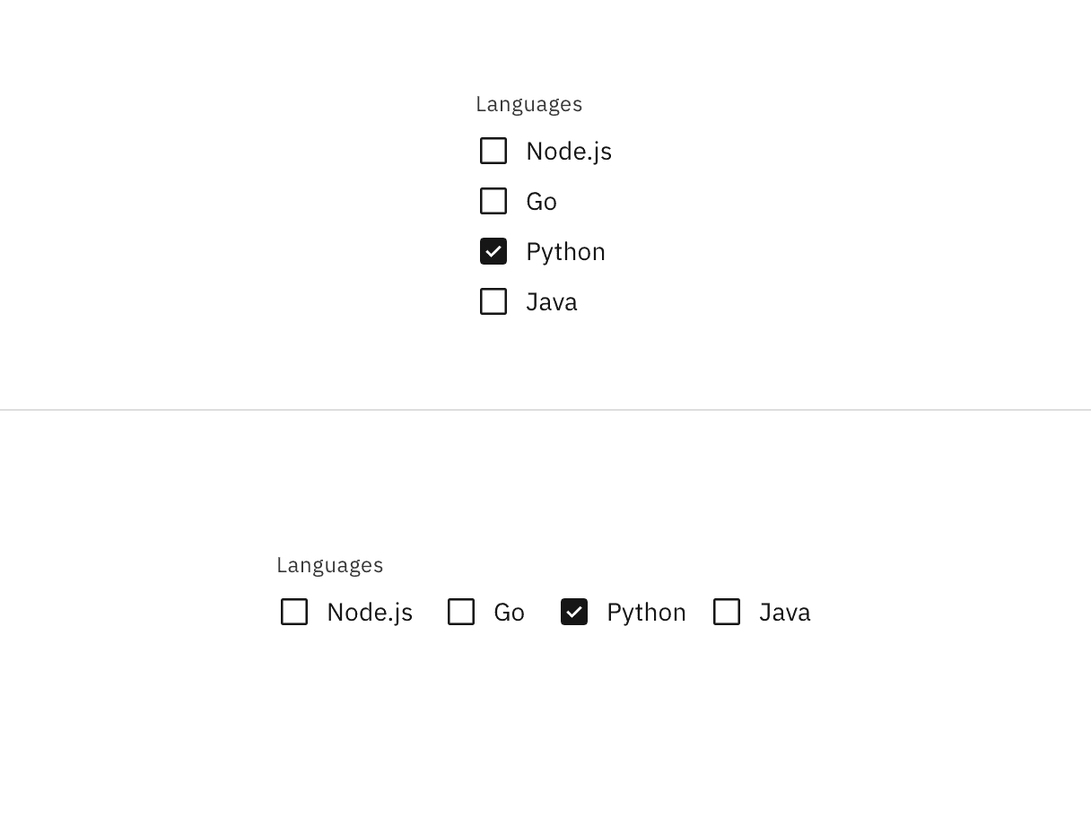
Checkboxes are used for multiple choices, not for mutually exclusive choices. Each checkbox works independently from other checkboxes in the list, therefore checking an additional box does not affect any other selections.
Live demo
Note
This live demo contains only a preview of functionality and styles available for this component. Actual widgets may not show the exact same behavior but similar to expected.
CBoxLayout:
    adaptive: [True, True]
    padding: dp(16)
    spacing: dp(8)
    orientation: "vertical"

    CLabel:
        text: "Group label"
        style: "label_01"
        color: app.text_secondary

    CBoxLayout:
        adaptive: [True, True]
        spacing: dp(8)

        CCheckbox:
            line_width: dp(0.5)

        CLabel:
            size_hint: None, None
            size: self.texture_size
            text_size: None, self.texture_size[1]
            text: "Checkbox label"
            pos_hint: {"center_y": 0.5}

    CLabel:
        text: "Helper text goes here"
        style: "label_01"
        color: app.text_secondary
Example
See also
API
- class carbonkivy.uix.checkbox.checkbox.CCheckbox(*args: Any, **kwargs: Any)[source]
Bases:
CIconCircular,StateFocusBehavior,ButtonBehaviorCCheckbox is a custom checkbox widget that inherits from AdaptiveBehavior, CIconCircular, BackgroundColorBehaviorCircular, StateFocusBehavior and ButtonBehavior.