Toggletip
Toggletips display and hide additional information upon the click of a UI trigger element. Toggletips can contain interactive elements.
Overview
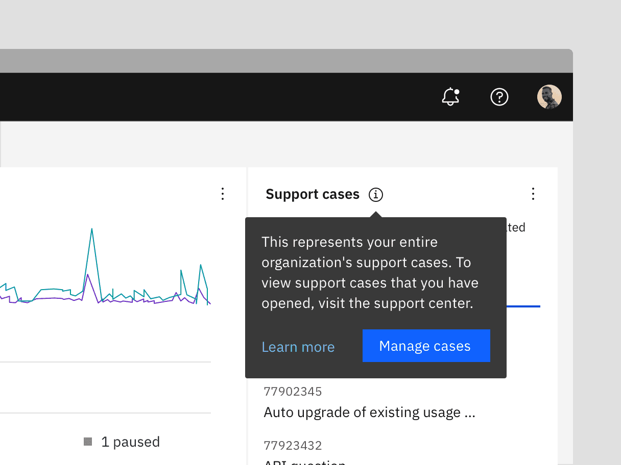
Toggletips reveal supplemental content when a user clicks a button and remains actively open until a user dismisses it. A toggletip is comprised of a UI trigger and toggletip content (based on the popover component). Toggletips can include a wide variety of information and interactive elements as long as accessibility requirements are maintained, including focus order and ensuring all functionality is operable through a keyboard interface.
Only vertical variant of CToggletip is available.
Live demo
Note
This live demo contains only a preview of functionality and styles available for this component. Actual widgets may not show the exact same behavior but similar to expected.
...

from kivy.metrics import dp
from kivy.properties import StringProperty
from carbonkivy.behaviors import TooltipBehavior
from carbonkivy.uix.link import CLink
from carbonkivy.uix.toggletip import CToggletip


class MyToggletip(CToggletip):

    text = StringProperty()


class ToggletipLink(CLink, TooltipBehavior):

    def __init__(self, **kwargs) -> None:
        super().__init__(**kwargs)
        self.tooltip = MyToggletip(
            text="Occasionally, services are updated in a specified time window to ensure no down time for customers."
            width=dp(288),
            margin=dp(2),
            pointer="Upward"
        )

kvlang = """
CScreen:
    ToggletipLink:
        pos_hint: {"center_x": 0.5, "center_y": 0.5}

        CLinkText:
            text: "Toggletip Label"

        CLinkIcon:
            icon: "help"

<MyToggletip>:
    CLabel:
        text: root.text
        color: app.text_inverse

    CButtonPrimary:
        text: "View more"
        role: "Large Productive"
"""

...
Usage
For embedding a toggletip to any widget, the widget needs to inherit from the TooltipBehavior class and then define a toggletip widget inheriting from CTooltip class.
Use the tooltip property to define the widget to be displayed as a toggletip.
Note
On DESKTOP platforms, the toggletip will appear if hovered over the widget, by default.
For this the widget should be an instance of the class HoverBehavior.
...

from carbonkivy.behaviors import TooltipBehavior
from carbonkivy.uix.toggletip import CToggletip

from carbonkivy.uix.button import CButtonPrimary


class MyToggletip(CToggletip):

    text = StringProperty()


class ToggletipButton(CButtonPrimary, TooltipBehavior):

    def __init__(self, **kwargs) -> None:
        super().__init__(**kwargs)
        self.tooltip = MyToggletip(text="This is a Toggletip.")

kvlang = """
CScreen:
    ToggletipButton:
        text: "Drag Me!"
        icon: "add--large"
        pos: [30, 30]

<MyToggletip>:
    CLabel:
        text: root.text
        color: app.text_inverse
"""

...
Example
from kivy.clock import Clock
from kivy.core.window import Window
from kivy.properties import StringProperty


def set_softinput(*args) -> None:
    Window.keyboard_anim_args = {"d": 0.2, "t": "in_out_expo"}
    Window.softinput_mode = "below_target"


Window.on_restore(Clock.schedule_once(set_softinput, 0.1))

appkv = """
CScreen:

    ToggletipButton:
        text: "Drag Me"
        icon: "add--large"
        pos: [dp(30), dp(30)]

<MToggletip>:
    CLabel:
        text: root.text
        color: app.text_inverse

    CButtonPrimary:
        text: "View more"
        role: "Large Productive"
"""

from kivy.input.providers.mouse import MouseMotionEvent
from kivy.lang import Builder
from kivy.metrics import dp
from kivy.properties import StringProperty

from carbonkivy.app import CarbonApp
from carbonkivy.behaviors import ElevationBehavior, TooltipBehavior
from carbonkivy.uix.button import CButtonPrimary
from carbonkivy.uix.screen import CScreen
from carbonkivy.uix.toggletip import CToggletip


class MToggletip(CToggletip):

    text = StringProperty()


class ToggletipButton(CButtonPrimary, ElevationBehavior, TooltipBehavior):

    def __init__(self, **kwargs) -> None:
        super().__init__(**kwargs)
        self.tooltip = MToggletip(
            text="This is a large Toggletip text.",
            width=dp(288),
            margin=dp(2),
            pointer="Upward",
        )

    def on_touch_move(self, touch: MouseMotionEvent, *args) -> bool | None:
        self.center_x, self.center_y = touch.pos
        return super().on_touch_move(touch)

class myapp(CarbonApp):
    def __init__(self, *args, **kwargs):
        super(myapp, self).__init__(*args, **kwargs)

    def build(self) -> CScreen:
        screen = Builder.load_string(appkv)
        return screen


if __name__ == "__main__":
    myapp().run()
API
- class carbonkivy.uix.toggletip.toggletip.CToggletip(*args: Any, **kwargs: Any)[source]
Bases:
BoxLayout- bg_color[source]
ColorProperty(defaultvalue=0, **kw) Property that represents a color. The assignment can take either:
a collection of 3 or 4 float values between 0-1 (kivy default)
a string in the format #rrggbb or #rrggbbaa
a string representing color name (eg. ‘red’, ‘yellow’, ‘green’)
Object
colormapis used to retrieve color from color name and names definitions can be found at this link. Color can be assigned in different formats, but it will be returned asObservableListof 4 float elements with values between 0-1.- Parameters:
- defaultvalue: list or string, defaults to [1.0, 1.0, 1.0, 1.0]
Specifies the default value of the property.
Added in version 1.10.0.
Changed in version 2.0.0: Color value will be dispatched when set through indexing or slicing, but when setting with slice you must ensure that slice has 4 components with float values between 0-1. Assingning color name as value is now supported. Value None is allowed as default value for property.
- element_x[source]
NumericProperty(defaultvalue=0, **kw) Property that represents a numeric value.
It only accepts the int or float numeric data type or a string that can be converted to a number as shown below. For other numeric types use ObjectProperty or use errorhandler to convert it to an int/float.
It does not support numpy numbers so they must be manually converted to int/float. E.g.
widget.num = np.arange(4)[0]will raise an exception. Numpy arrays are not supported at all, even by ObjectProperty because their comparison does not return a bool. But if you must use a Kivy property, use a ObjectProperty withcomparatorset tonp.array_equal. E.g.:>>> class A(EventDispatcher): ... data = ObjectProperty(comparator=np.array_equal) >>> a = A() >>> a.bind(data=print) >>> a.data = np.arange(2) <__main__.A object at 0x000001C839B50208> [0 1] >>> a.data = np.arange(3) <__main__.A object at 0x000001C839B50208> [0 1 2]- Parameters:
- defaultvalue: int or float, defaults to 0
Specifies the default value of the property.
>>> wid = Widget()
>>> wid.x = 42
>>> print(wid.x)
42
>>> wid.x = "plop"
 Traceback (most recent call last):
   File "<stdin>", line 1, in <module>
   File "properties.pyx", line 93, in kivy.properties.Property.__set__
   File "properties.pyx", line 111, in kivy.properties.Property.set
   File "properties.pyx", line 159, in kivy.properties.NumericProperty.check
 ValueError: NumericProperty accept only int/float
Changed in version 1.4.1: NumericProperty can now accept custom text and tuple value to indicate a type, like “in”, “pt”, “px”, “cm”, “mm”, in the format: ‘10pt’ or (10, ‘pt’).
- margin[source]
NumericProperty(defaultvalue=0, **kw) Property that represents a numeric value.
It only accepts the int or float numeric data type or a string that can be converted to a number as shown below. For other numeric types use ObjectProperty or use errorhandler to convert it to an int/float.
It does not support numpy numbers so they must be manually converted to int/float. E.g.
widget.num = np.arange(4)[0]will raise an exception. Numpy arrays are not supported at all, even by ObjectProperty because their comparison does not return a bool. But if you must use a Kivy property, use a ObjectProperty withcomparatorset tonp.array_equal. E.g.:>>> class A(EventDispatcher): ... data = ObjectProperty(comparator=np.array_equal) >>> a = A() >>> a.bind(data=print) >>> a.data = np.arange(2) <__main__.A object at 0x000001C839B50208> [0 1] >>> a.data = np.arange(3) <__main__.A object at 0x000001C839B50208> [0 1 2]- Parameters:
- defaultvalue: int or float, defaults to 0
Specifies the default value of the property.
>>> wid = Widget()
>>> wid.x = 42
>>> print(wid.x)
42
>>> wid.x = "plop"
 Traceback (most recent call last):
   File "<stdin>", line 1, in <module>
   File "properties.pyx", line 93, in kivy.properties.Property.__set__
   File "properties.pyx", line 111, in kivy.properties.Property.set
   File "properties.pyx", line 159, in kivy.properties.NumericProperty.check
 ValueError: NumericProperty accept only int/float
Changed in version 1.4.1: NumericProperty can now accept custom text and tuple value to indicate a type, like “in”, “pt”, “px”, “cm”, “mm”, in the format: ‘10pt’ or (10, ‘pt’).
- on_touch_down(touch)[source]
- on_touch_up(touch)[source]
- pointer[source]
OptionProperty(*largs, **kw) Property that represents a string from a predefined list of valid
options.
If the string set in the property is not in the list of valid options (passed at property creation time), a ValueError exception will be raised.
- Parameters:
- default: any valid type in the list of options
Specifies the default value of the property.
- **kwargs: a list of keyword arguments
Should include an options parameter specifying a list (not tuple) of valid options.
For example:
class MyWidget(Widget):
    state = OptionProperty("None", options=["On", "Off", "None"])
- radius[source]
VariableListProperty(defaultvalue=None, length=4, **kw) A ListProperty that allows you to work with a variable amount of
list items and to expand them to the desired list size.
For example, GridLayout’s padding used to just accept one numeric value which was applied equally to the left, top, right and bottom of the GridLayout. Now padding can be given one, two or four values, which are expanded into a length four list [left, top, right, bottom] and stored in the property.
- Parameters:
- default: a default list of values
Specifies the default values for the list.
- length: int, one of 2 or 4.
Specifies the length of the final list. The default list will be expanded to match a list of this length.
- **kwargs: a list of keyword arguments
Not currently used.
Keeping in mind that the default list is expanded to a list of length 4, here are some examples of how VariableListProperty is handled.
VariableListProperty([1]) represents [1, 1, 1, 1].
VariableListProperty([1, 2]) represents [1, 2, 1, 2].
VariableListProperty([‘1px’, (2, ‘px’), 3, 4.0]) represents [1, 2, 3, 4.0].
VariableListProperty(5) represents [5, 5, 5, 5].
VariableListProperty(3, length=2) represents [3, 3].
Added in version 1.7.0.
- set_visibility(instance: kivy.uix.widget.Widget, visibility: bool, *args) None[source]
- text[source]
StringProperty(defaultvalue=u’’, **kw) Property that represents a string value.
- Parameters:
- defaultvalue: string, defaults to ‘’
Specifies the default value of the property.
- update_pos(instance: kivy.uix.widget.Widget, *args) None[source]